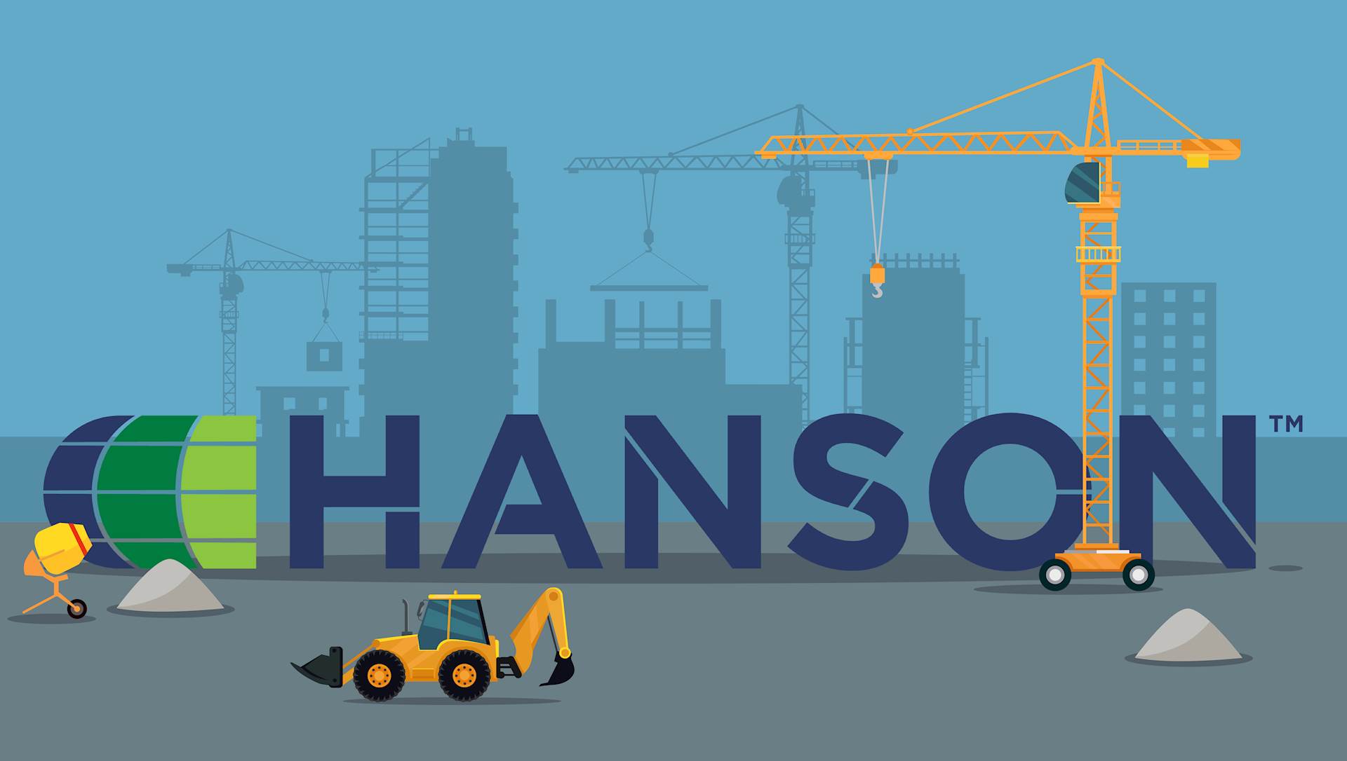
As Hanson moves into 2025, we are excited to unveil the updated Hanson logo. The refreshed design represents more than just a new look -- it’s a reflection of our commitment to innovation, excellence and delivering lasting, sustainable results for our clients. We pride ourselves on providing forward-thinking solutions for every project we take on, and we’re energized by this fresh chapter and the opportunities it brings to partner with you. We invite you to learn from our chairman and CEO, Sergio “Satch” Pecori, why we chose to rebrand and what this change means for the future of Hanson.
Q: What prompted the decision to rebrand?
SATCH: We were encouraged to by a consultant that works in the AEC space. Our logo had been in place since 2001 and was looking a little dated. It is typical for companies to rebrand every 7-10 years or so.
Q: What is the primary goal of this rebranding effort?
SATCH: We wanted an updated look, but our focus was making sure we could communicate our commitment to innovative and earth-friendly solutions.
Q: What were the key factors in deciding on the brand’s visual style, including its colors, font and design choices? What do they represent?
SATCH: Even starting out, we felt strongly that we wanted an evolution of our logo, not a complete departure. We stayed with a globe theme, but we streamlined it and made it less literal. We still have an emphasis on the navy-blue color that we’ve had since the 1970s, but we wanted to evolve our color palette, and green was the natural choice. We really like that the green represents sustainability and resiliency.
Q: Has the rebrand been influenced by any plans to expand services or enter new markets?
SATCH: Hanson has always been focused on growing to better serve our clients, and the new logo helps show them -- and the rest of the world -- that we are aligning ourselves for the future.
Q: What do you hope clients will associate with the rebrand?
SATCH: We hope clients will see that we are continuing to grow, and that we are always focused on successful, sustainable outcomes for their projects.
Q: What challenges did Hanson face during the rebranding process?
SATCH: One of the biggest challenges was keeping the new logo from being discovered internally! We were also developing a new website (stay tuned for that), which involved a large committee. Everyone on the committee had to be sworn to secrecy, because they were going to see the new logo on the website design.
Q: Any additional information you would like to share?
SATCH: We have been very happy to see how the employees have embraced the logo change. We keep hearing that the logo looks and feels fresh, and we are excited about it. It has been amazing to see the enthusiasm so far. The current challenge is patience, since the logo needs to be changed in so many places.